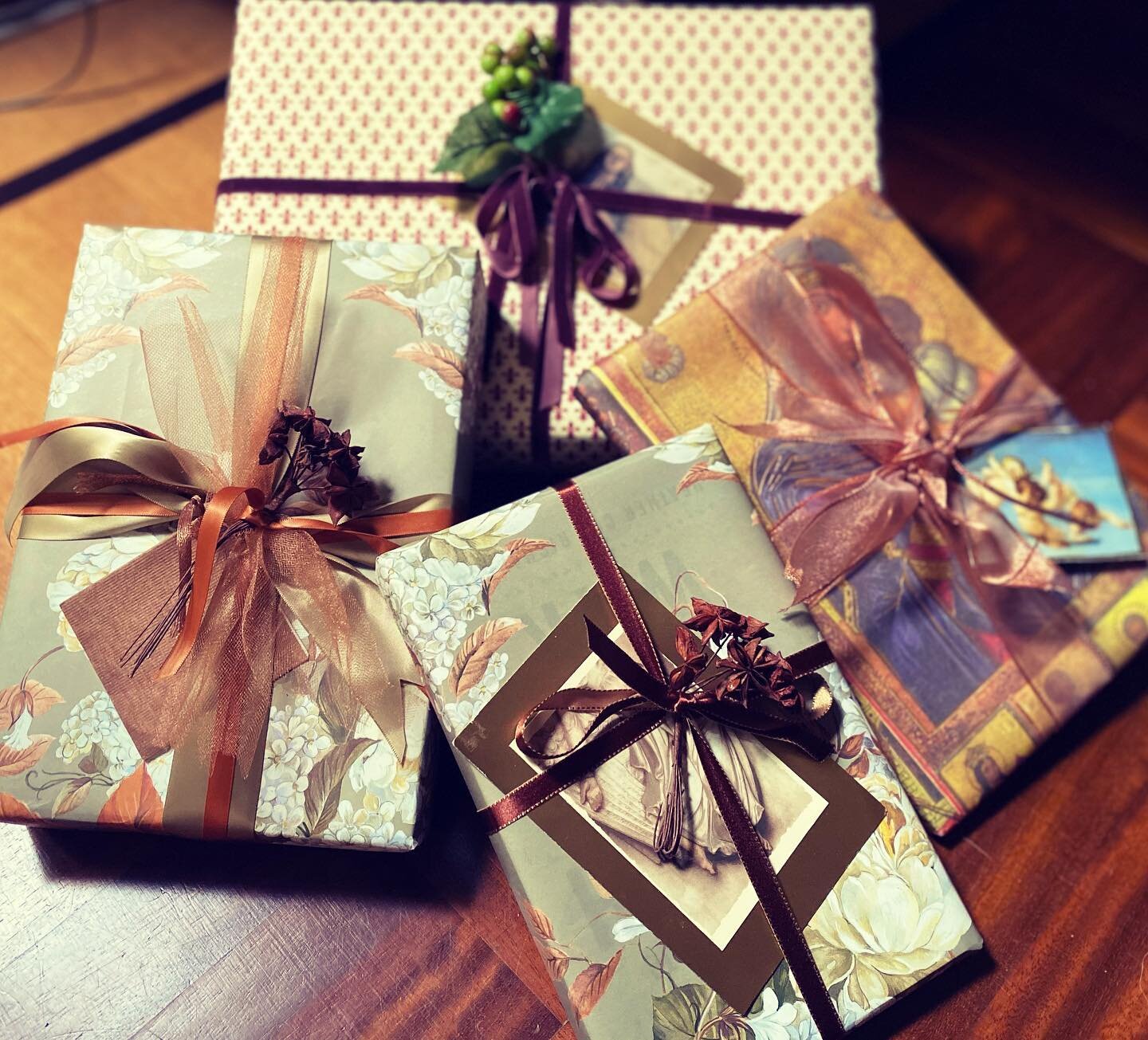
Many factors are influencing color trends now: our kitchen-centric lives, ecology, sustainability, global perspectives, and – high def TV! We are so used to seeing the clear, crisp, saturated colors on our TV sets that it’s translating to more intense hues being found on our products.
I just attended two different color forecasting seminars, one presented by Leatrice Eisemann of the Pantone Color Institute and the other by Parker Paint/Comex.
I just attended two different color forecasting seminars, one presented by Leatrice Eisemann of the Pantone Color Institute and the other by Parker Paint/Comex.
Pantone’s forecast was much broader (9 different palettes!) and, admittedly, intended for cross purposes: fashion, industrial products, even cars; Parker’s had 4 different palettes, and, being paint, is more geared toward shelter and furniture. A common thread of both is the dichotomy between the organic world and the high tech world. Both of them feature brighter palettes and lots of metallic, purple, greys, and green (even avocado) – where they diverge is Pantone’s generous use of Mauve. Not the pale, greyed-out mauve we remember from the 80’s (ugh) but a more vibrant, intense tone. Here’s the lowdown for 2010/11:
Pantone View Home 2010 Palettes
- Greenmarket: Think organic – eggplant, avocado, heirloom tomatoes, wine, spices
- Resourceful: Natural world – aqua sky, ochre earth, deep rust – all mixed with orange and orchid
- Transformations: Romantic – pink, beige, mauve, clear minty green, grays, gold
- Ambiance: Understated – pastels mixed with grey, deep black/brown, clear sky blue
- Gatherings: African-inspired – warm, natural colors with a pop of mauve
- Galaxy: Night sky – deep blues and greens with gold and silver metallic
- High Definition: Clear, saturated color – black, white & grey with purple, fuchsia, gold, and silver
- Pastiche: Japanese anime-inspired – bright gold, pink, blue, Mimosa yellow (Pantone’s color of the year for 2009), with brown and grey added to the mix
- Tinged Neutrals: Always a good bet – these, however, have a little twist with the addition of champagne iridescence, sage, and grey
Parker Paint/Comex 2010/11 Palettes
- Fresh Revolution: Neutral – very similar to Pantone’s Tinged Neutrals with greys, silver sage, and celery/kiwi green
- Organic Imitation: Green, purple, metallic gold & silver with a jolt of deep teal and fuchsia
- Reinvented Bloom: Brights with black, putty, sand, and a little sky blue thrown in for quirkiness
- Glocal Mix: Ice cream shades - warm weather inspirations - along with faded out red/white/blue, with milk chocolate
These palettes are simply guidelines, not hard and fast “rules”. Some of the most interesting and fresh color combinations I saw were purple/avocado and burnt orange/turquoise (Pantone color of the year for 2010!).
The most important thing is to use color that inspires and that you love!
